
RitmoVan
Latin American Music Festival
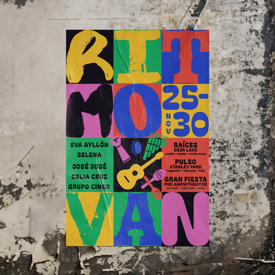
RitmoVan is a five-day celebration of Latin American culture bringing vibrant rhythms and dance to Vancouver's PNE Amphitheatre, Stanley Park, and Deer Lake. From salsa and cumbia to rock, funk, and folklore, it unites Latin American communities and music lovers across Metro Vancouver.
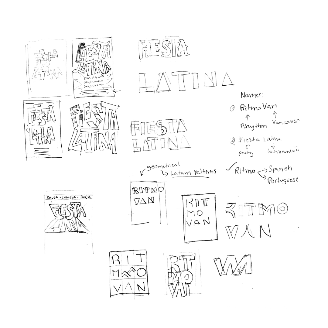
Ideation
Many posters representing Latin America use freeform or maximalist layouts to evoke energy. To convey the same cultural vibrancy within a structured composition, I employed a square grid system, challenging myself to balance order with expressive design.
Process
Throughout the design process, I explored different typefaces and compositions to balance expressiveness with legibility. I also tested multiple colour palettes to capture Latin America's vibrant tones while introducing grounding hues for visual harmony.
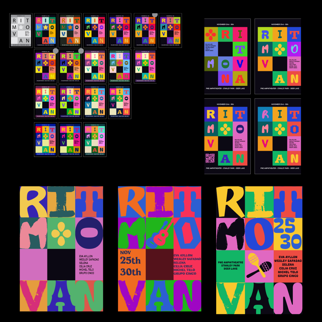
Results
The final poster combines five typefaces reminiscent of Latin American streetscapes and media with a six-colour palette that conveys the vibrancy and dynamic spirit of the culture.